
In this series I’m exploring some of the new features as well as a few improvements to older ones in the recently-released MindManager 2018. In the first part I looked at improvements to a recently-introduced feature, Map Roll-ups, as well as the revival of a feature which was last seen as an add-in for MM 2012 – Conditional Formatting. This time I’ll examine changes to MM’s filtering facility and the completely new Priority and Schedule Views.
Filtering and SmartFade
It’s a long time since there’s been any major change to the filtering facility in MM, so the introduction of SmartFade is a pleasant surprise.
However, I’m still getting used to how SmartFade works. In MM2018 there is a new Filter – Fade icon on the Status Bar and a similar Fade button on the Filter tab on in the View ribbon. These show only task-related filtering, like the “Show” button (more on that in a moment). Furthermore, use either of these options and you will most likely fade out the topics you are filtering for. This may be your aim but I suspect that most people want to do the opposite – to fade out all the topics other than the ones they are filtering for.
To do this consistently you have to delve into the MM Options dialogue box. Click on Filter and you will see there is a new option – “fade non-matching topics”. Tick the box and when you attempt to use SmartFade in future the unwanted topics should fade (rather than vice versa) and will always fade rather than disappear.
Onto using SmartFade itself. The MM 2018 release notes state that “SmartFade functionality brings your selected items into sharp focus, while keeping the rest of your map visible in the background”. This somewhat understates the significance of this feature, which actually provides a neat solution to some major problems with how filtered maps are displayed.
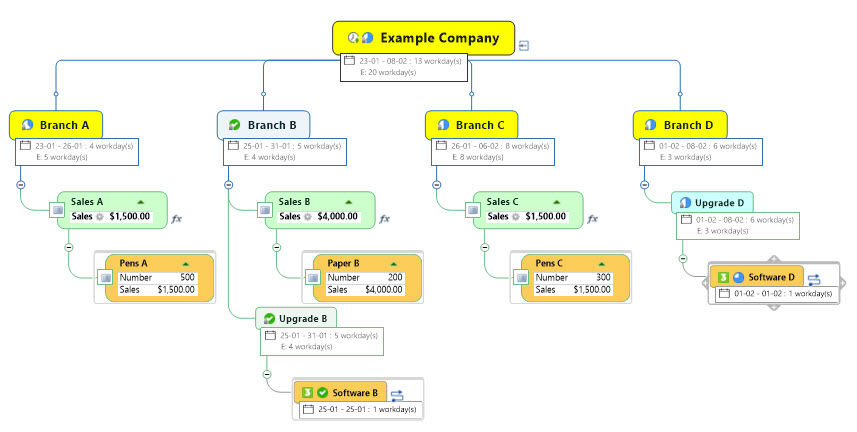
Consider the map of a hypothetical stationery company below in which I’ve given some randomly-selected topics a light tan colour:

Example Project Map
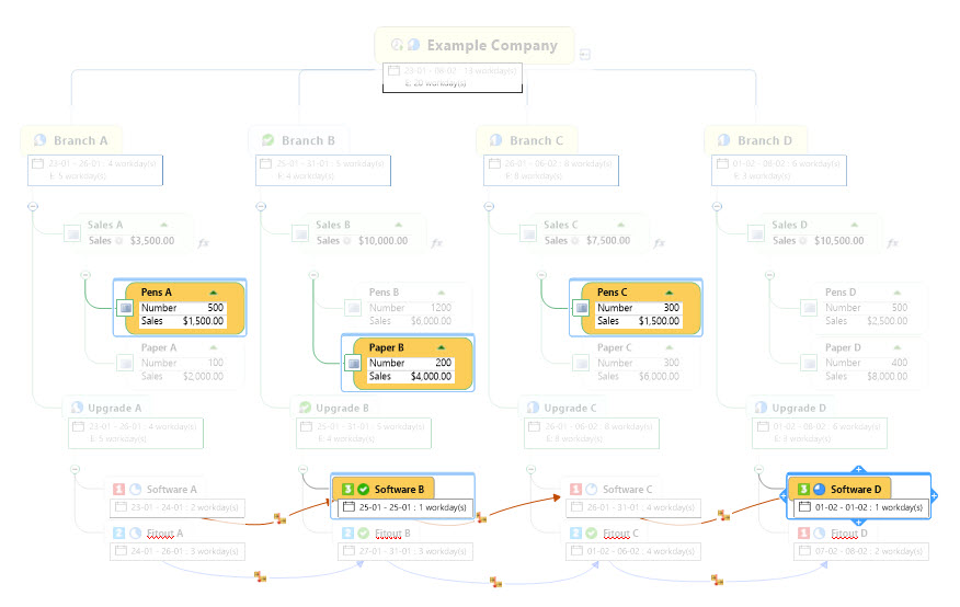
Below is the same map with a conventional filter for topics matching this colour has been applied:
Example project map with a conventional filter
There are a couple of issues which are obvious in this example but may be less so in other maps if the filter criteria are based on more obscure attributes. The first of these is that a lot of topics that don’t match the filter criteria are still visible in the map; these are the parent topics and sub-topics of the filtered topic.
Conversely, all of the rest of the map has simply disappeared so you no longer have a sense of the overall structure and scale of the map. This also has the effect of shrinking the distance between the filtered topics as branches and other topics at the same level are removed.
The following map has the same filter but uses SmartFade to highlight the filtered topics. These stay where they are while the rest of the map is faded out, looking almost like the ghost of itself.
Example project map filtered with SmartFade
This approach makes the map much easier to read. While the whole of the map is shown the filtered topics are easy to spot and now you can see them in context.
There are a number of other minor changes, mainly relating to the icons representing filtering on the View ribbon and the Status Bar. The filtering commands specifically relating to task attributes are now separated into their own icon and drop-down menu on the ribbon which is somewhat confusingly called “Show”. The full suite of filtering commands is still available under the Power Filter command, which leads to a menu with two choices – Power Filter, and Power Filter Options. These lead to different tabs on the same Power Filter dialogue box.
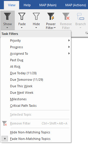
MindManager 2018 View Show (Task Filters) Tab
A similar arrangement applies on the Status Tab at the bottom of the screen. The default (at least as it installed on my computer) is for only the “Filter – Show” icon to appear. It is not immediately clear that Power Filter option is available from the Status Bar Configuration menu – and when you opt for the Power Filter icon to be available, it displaces the Filter – Show icon which is shoved to the left past the Filter – Fade command.
Priority and Schedule Views
Like many of the features added or upgraded in MM2018 such as map roll-ups, conditional formatting and SmartFade, the new Priority and Schedule views provide additional ways to “dissect” complex maps, especially task-oriented, to provide more focused views of the content.
Both views are found on the View tab and work in similar ways. The Priority View is the most straightforward, organising tasks with a priority icon into columns based on these priorities. In default mode the first column is Uncategorised, and all topics without priority are allocated here.
The Priority View ribbon has commands to move the legend location (the column headings) to the top or bottom of the window and to show or hide topic formatting. The More Options icon leads to a dialogue box with options to add icons to topics to indicate they have sub-topics, to dock the legend to the widow pane (so it doesn’t disappear when scrolling) and to show or remove unprioritised topics which removes the Uncategorised column and its contents. There are also options to sort topics in columns in map order or, alphabetically or by start or due date. In addition, the priority columns can be hidden or displayed in the Legend.

Example task map Priority View
Relationship lines are also shown and if all this wasn’t enough the Priority View is dynamic. Change the priority of a task and it will leap to the correct column. In addition, task priority is preserved when synchronising with Outlook and can be edited in either program (bearing in mind the limitation that Outlook has only three priority levels).
Schedule View is similar but more complex. It arranges the map into date-based columns; the default is a day to a column, with an Unscheduled column taking the place of the Priority View’s Uncategorised. As with the Priority View individual columns can be hidden.

Example task map Schedule View
The Schedule View ribbon offers quite a few more configuration options than its Priority View equivalent, due in part to the fact that the Schedule View could involve many more columns than the Priority View’s maximum of five. The are options to go to the start, end or today, select a specific date range, select a Time Scale (Days, Weeks, Months or Years), Show Topics on start or due date, go and as with Priority view show or hide topic formatting.
Except for the latter all these options are obviously schedule-specific, but there is one that should be included in the Priority View but isn’t – Mark Done. This allows the user to go through the map and tick tasks off as complete without having to go to the Task Info Pane.
The More Options button also reveals a wider range of choices than it does in Priority View. The additional options include Show Date range, hide dates on topics, and the ability to hide both non-working days and columns with nothing scheduled. Like Priority View, Schedule View is dynamic – change a task’s due date and it will move immediately to the appropriate date column – and synchronisation with Outlook is also maintained.
In practice Schedule View is a little more confusing than the Priority View. This is because it essentially includes anything with a progress icon, including parent tasks which show roll-up task info. This does not occur in Priority View as parent tasks generally don’t have their own priority icons. It would be helpful if there was an option to hide topics with rolled-up task information in Schedule View.
While each is useful in its own right, all the new features I’ve discussed so far can be combined with each other to produce additional benefits. Adding the MAP add-in can also leverage these benefits further, as I’ll outline in a future post.

Pingback: What’s new in MindManager 2019 2: Tag along for the view | Sociamind